![]() Welcome to Apple iPhone School’s Logo Design Contest. AppleiPhoneSchool.com has been running since it’s beginning without a logo and it’s about time we get one! So, we thought it would be a great idea to create a contest! Of course, every contest has it’s prizes. There will be prizes for the top 5 designs. The main prize being an 8GB iPhone or an 16GB iPod Touch, the winner choosing which they would prefer. Logo submission is over. There is now 1 week of voting/commenting from April 23rd to April 29th where logos will be displayed on this site & this Flickr pool. With your help, we will make the final decision and announce the winners April 30th. Below is a breakdown of prizes and the contest rules. Good luck!
Welcome to Apple iPhone School’s Logo Design Contest. AppleiPhoneSchool.com has been running since it’s beginning without a logo and it’s about time we get one! So, we thought it would be a great idea to create a contest! Of course, every contest has it’s prizes. There will be prizes for the top 5 designs. The main prize being an 8GB iPhone or an 16GB iPod Touch, the winner choosing which they would prefer. Logo submission is over. There is now 1 week of voting/commenting from April 23rd to April 29th where logos will be displayed on this site & this Flickr pool. With your help, we will make the final decision and announce the winners April 30th. Below is a breakdown of prizes and the contest rules. Good luck!
Here’s the breakdown of prizes:
(More prizes may be added as they come in. Check back here often)
1st Place
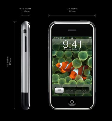
8GB iPhone or 16GB iPod Touch
V-MODA Vibe Duo Headphones – Provided by V-MODA
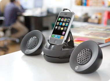
DLO Portable Speakers – Provided by DLO.
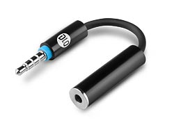
DLO Headphone Adaptor – Provided by DLO.
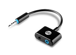
DLO Headphone Splitter – Provided by DLO.
Wireless Emporium Car Charger – Provided by Wireless Emporium.
Wireless Emporium Travel Charger – Provided by Wireless Emporium.
Choice of Case
Choice of Otterbox Case – Provided by OtterBox
Lifetime Subscription to Caterpillar Application by RiP Dev – Provided by RiP Dev
Wireless Emporium T-shirt – Provided by Wireless Emporium.
2nd Place
V-MODA Vibe Duo Headphones – Provided by V-MODA
Choice of Case
Other Otterbox Case – Provided by OtterBox
6 month subscription to Caterpillar Application by RiP Dev – Provided by RiP Dev
Wireless Emporium T-shirt – Provided by Wireless Emporium
3rd, 4th, & 5th Place
Choice of Case
6 month subscription to Caterpillar Application by RiP Dev
Cases to Choose from:
1 DLO SlimCase (iPhone) – Provided by DLO.
1 DLO Jam Jacket (iPhone) – Provided by DLO.
1 DLO Action Jacket (iPhone) – Provided by DLO.
1 DLO HipCase (iPhone) – Provided by DLO.
1 Agent18 EcoShield (iPhone) – Provided by Agent18
1 Agent18 Flower Vest (iPod Touch) – Provided by Agent18
1 Wireless Emporium Case (iPhone) – Provided by Wireless Emporium
2 OtterBox Cases – Provided by OtterBox
Defender Review by AppleiPhoneSchool.com
Now for the fun part, the rules:
1. Obviously the logo must be original, created by you.
2. This site is rated G. No inappropriate material will be accepted.
3. The logo can not contain a logo from anywhere else for example, the Apple logo. It may however contain an apple.
4. The logo can not contain any other design from Apple such as icons or the iPhone itself. That’s right, the logo can’t have an iPhone in it. :(
5. We prefer the logo to be in vector format. This way it can be stretched to fit business cards, t-shirts, web, billboards etc. If you have other thoughts on this, please email logo@appleiphoneschool.com.
6. You must also submit a 60×60 pixel, 72dpi PNG image for a webclip icon that mimics the logo you’ve designed.
7. If the words Apple iPhone School are in the logo, they must be easily changeable incase Apple makes us change our name someday. See this article from modmyifone once known as modmyiphone. We already own ifoneschool.com just incase. :)
8. Include the font file.
9. Include a jpg or png example of logo.
10. You will also need to submit a black and white version of the logo for 1 or 2 color print jobs.
11. Email your logo to logo@appleiphoneschool.com. Please title the subject “Logo Design Contest”.
Frequently Asked Questions
Q. You did not give out the size of the logo. Only the 60*60 one for the webclip icon. So what is the size of the logo and DPI? Is it like a banner where you will place it on the site and so on?
A. I did not put a size because the logo will need to be scalable. It will be used on both print material and web. A vector image is the best, like one done in Adobe Illustrator. If you are using something like photoshop, the final submitted file must be very large and high resolution. That way if we want to make t-shirts, billboard, etc, we will have a high quality image.
Q. How many Logos can we submit per person?
A. There is not a limit. :)
Q. What about the people from other countries?
A. Residents of the province of Quebec in Canada are ineligible to participate. Residents of Cuba, Iran, Syria, North Korea, Myanmar (formerly Burma) and Sudan are also ineligible to participate. The Contest is void in these countries and where prohibited or restricted by law. We reserves the right to limit, or restrict upon notice, participation in the Contest to any person at any time for any reason.

Not all of them show up in that window, but I’d say these are the best so far:
AshA-3 *
Manuel S. #23 and #7
Kelly K #1
Jason M #1
The prize is not the main thing why I took part to the contest! The main point is to be memoried for a time…and that is cool! ;)
Yes….the iPhone is nice, too…
Logos are still being uploaded guys…please be patient! Thanks! We will try to have them all up by tomorrow.
Theres actually no logo that I like…
Then you have to wait! :D
could it be that some of Manuel S.’s stuff isn’t original? Some of them look quite familiar and they range of skill in his stuff are polar opposites, what’s up with that?
If we find any that any of the logos submissions are not original designs, as stated in the rules, they will be omitted from the contest.
I know I’ve seen at least a few of these somewhere else before. I work with Joomla quite frequently, and am thinking the connection is there somewhere. That said, I also surf the web religiously, so who knows.
I belive there are services that check for copyright infringement by running advanced queries on huge databases. Might be worthwhile to look into such a service for the submitted designs. Plagerism should not only result in ommision of the copied design, but of all designs submitted by the artist, in my opinion.
i already found his logos in “logomaid.com” and “istockphoto.com” …..
shame
Manuel S. has been eliminated from the contest. All logos have been removed. They were left up until now to gather more sources of info and to alert artists. Thanks for everyone help on this!
I wonder if the deadline can be extended
I still prefer mine :) but actually isn’t updated! ^^
The Flickr poll isn’t really a poll right ?
Any idea of when all the logo’s will possibly up by?
Sorry….I was missing the “be” in “…will possibly be up by?”
: )
The logos should plan for the future a little better by using “iFone School”. Apple iPhone is a obviously copyrighted/protected name and shouldn’t have been used in the first place in the name of the company/website.
Some logos I saw… mm they didn’t follow the logo design contest rules.. should be in vector (for flexible use).. and some are not really logo I think.. too busy and not scalable.. some includes the iphone itself, where it is not allowed..
Yes, all logos were added for now however, the ones that break any of the rules will not be considered. In a few days we will put up a list of our top the top ten which will all be within the rule guidelines.
Can we put our votes in? I say:
1 – Gerald O. #1
2 – Javier S. #2
3 – Pieter T. #1
Good Luck, everyone!
I mean all logos, even ones that break the rules. They were put up for inspiration and give others ideas. We are still trying to upload them all. Not everyone sent them in correctly and there are around 200 I believe.
I’m still being inspired! I can’t stop drawing! Help!!! ;)
Great contest, great designs. I’ll surely recommend this process to my clients in the future. Out of curiousity, where did you guys get the idea for a contest?
Cheers,
-K
How do you cast your vote on Flickr? Do you just comment? Where do you click to vote? HELP!!!!
Flikr doesn’t have a voting system per sey, however it seems that constructive critiscm is being taken into consideration in the form of comments on the design(s). There is also an ‘add to favorites’ feature. I hope this helps!
Cheers,
K
Hey!!!.. i have only seen one logo that is really awesome… and that is Job T-#2, the design of the logo is very syntetic, and shows the really meaning of the school, with the digital mark shows the touch part of the iphone.
So my vote goes to…. Job T-#2
I am an avid supporter of iphone users via many various and sundry IRC channels that exist pertaining to the device. Right now, I have an iPod Touch; and while it does allow me to provide my advice and guidance on 90% of the applications, I find that there’s limitations to the type of support I can provide, especially from a hardware perspective.
So, while it’s nice to think that the posterity is the only reason one takes part in such contests, (and don’t get me wrong, it’s always a great feeling to have a design be used in such ways) for me, the iPhone would really be a vast improvement. :)
Good Luck everyone; and, if you can’t use the Prize; I certainly can. ;)
Here’s my vote:
Jeff W. #3
Simple. Clean. Iconic and incorporates the apple, iphone, and school.
In keeping with Apple’s “crisp” interface and design I think this would blend well with appleiphoneschool.com’s website.
I believe the only “FAIR” way to vote is to let the fine folks at appleiphoneschool.com do their own voting. Our votes can’t mean anything after some of the stunts being pulled. Ripping art work… bad-mouthing other’s works… acting like you’re some one else voting for your “own” work… ridiculous…
Oh, what we’ve seen here is nothing.
I’ve been part of other online voting systems in the past, and the antics were far worse than those here. Polls that fell prey to automated scripts which placed votes from proxies all over the world. As you can imagine, the results were completely worthless.
It’s definitely of some comfort to me that AppleiPhoneSchool.com will be making the final selection; difficult as that will likely be.
Wow.. yeahh.. so funny!..
“acting as somebody else and vote for own design” LoL! ( ^ ^,)
Yes.. agree to ‘OptimusGeorge’.. the fair way to vote.. let the guys at appleiphoneschool.com to shortlist the submission…
and perhaps they may ask for a ‘revision/tweaking’ to the “shortlisted submission” without taking other designers concept/idea…
once we have 3 candidates (logos), then “we” (the community) can participate to the poll of it…
…dunno…
..just my two cents..
:)
i agree with the last two comments, i actually tell some of my friends to go and look arround but they just comment on mine so i’m sorry for doing that, i think the user “diplomatiik” is actually jason G XD he comments on his own logos and say that are beautifull, cute, better and he only have his logos on his favourites! XD
i like what Pieter DT says and actually nice portfolio Pieter :)
Good news is, this isn’t a popularity contest. I could very well have all of my friends, family, contacts, associates, colleages, aquaintances and perfect strangers log on and give props to my designs; but the reality is, Doug, Brooke & Co will decide which design THEY like; that is, which one they feel best reflects AppleiPhoneSchool, and will provide them with a lasting brand.
I don’t envy them their decision; there are countless good designs in the contest, and picking a logo isn’t something to take lightly. I do like the idea of narrowing down the finalists and having them make revisions with their direct insight. Every logo submitted to me is but a draft; a demonstration of potential. The chances that someone ‘hit the nail on the head’ without any direct feedback are quite slim.
All of that said, I couldn’t agree more with the prior posts; This isn’t a contest to see how many people you can get to comment on your designs (Job T.) this is a design contest with only one judge; AppleiPhoneSchool.com.
Cheers,
Kelly K.
IN DESIGN…..
“LESS IS MORE”
“TNX 4 U’R CRITIC”
I have a question Is this a forum to vote? or a forum to say a lot of things of other persons and logos…. this is to everybody
….:::: If you really trust in your logos… Why is necessary to speak ill of others::::…. just think man…. wathever… THIS IS JUST A CONTEST:::… LUCK!
Sorry for everything said if it was not true! XS bye drama! will be back till 1st or 30th see ya, good luck everyone :)
What about the eligibility of participant from India ? A country with no iPhones at all [Shipping by Apple Inc.]
Good luck everyone, it was some serious competition for this one and I’m glad to be a part of it. Winners will be announced in just 2 days! Hoping to see you guys around the community of iPhone users, keep up the work…I’d like to see how we each develop after this contest. We learned what works and what doesn’t so our art doesn’t just stop here, it has actually progressed us and given us more experience as designers and artists.
Slap one more for the portfolio: Apple iPhone School contestant entry!
I’m sorry for my previous angered comments I really regret saying a lot of those things. Its about the effort and time we put into our work and everyone perceives the world differently, it was mean of me to make many of the criticisms I made and I am sorry for all the artists that came under that negligent fire. I have come into realization that I may not the best artist and it depends on the viewpoints others have. Let’s just see what AiPS has in taste, and I’m sorry to you as owners of the site with all the ruckus my anger and anticipation may have caused.
I think it’s difficult sometimes to take constructive criticism in stride; however as artists; that’s our charter. Everyone, from the customer, to peers, to perfect strangers has their opinion about what is visually pleasing. AppleiPhoneSchool does not have an easy task ahead of them.
That said, it behoothes them to also consider the individual along with the design. They will have a relationship with whomever they choose for as long as they decide to use the final design. Tweaks are always necessary, and it’s often the artist him or herself that is in the best position to make the necessary adjustments.
It is for this reason that it’s in all of our best interests to keep this particular contest civil. It’s also what makes it so unfortunate that some have been less than moral in their conduct so far.
Jason is right about one thing though; the end of this contest is upon us! I for one am anxious, nervous, and excited all at the same time. :)
Good Luck everyone; I really mean that!
Cheers,
K
maybe not? maybe they couldnt open the file to be able to format it for flickr, but surely if you recieved the reply “thank you for your submission” they must have your logo. My first logo isn’t up there either, I think its still in the competition just wasn’t uploaded maybe because of the same reason. good luck with that.
I have a question. how you ca vote for a logo that haven’t title?
I’m not sure which one you are talking about but if you are saying this from looking at the slideshow on the top then
a) you can get the name of the logo by clicking on the logo
b) i suggest you view the flickr set instead of the slideshow…its much easier, and i dont think people realize the slideshow doesnt show all the logos in the pull up menu on the bottom…you have to click on the last one and click next on the top to see the next set of logos
@Rosenfeldt Did you sent it before the deadline ? maybe there were some hours of difference :o.
So winners will be declared midnight today or just some random time tomorrow?
Okay, here’s my attempt at a NON BIASED rating…. Mine aren’t included for obvious reasons. I can’t rightly include them in a list of top artists without putting someone off. So; while I may or may not be convinced of their superiority… (haha) I’ll let you guys judge them, and leave my critiques to works that are not my own.
The top seven have been chosen based on my many years as an artist, designer, and web master. These designs either make the grade as brand marks, or are unique enough to stand alone as effective logos for AppleiPhoneSchool.com. As many of us know; logo design is a balance of form, function, and simplicity; and these seven have done it very well in my opinion.
All of that said, this is but my opinion. It may help, it may not. Either way, I hope it’s taken in stride. It’s been a pleasure viewing the submissions for this contest; and antics aside, it’s been great to take part in the review of the submitted designs.
Here’s my personal opinion as to what the top seven designs are.
7. Andy O. #3
(http://www.flickr.com/photos/appleiphoneschool/2433027642)
I really dig the simplicity of this design. This one goes to show that the simplest methods are often the best. The icon in particular shows up well, and the green color goes well with the AppleiPhoneSchool site in its current form. (Why didn’t I think of using Green!?) ;)
6. Jason G. #6
(http://www.flickr.com/photos/appleiphoneschool/2437295163)
This one is on the list for its potential. I think if Jason added the same gloss that Richard H, Paul F, or even I did on some of mine, his would easily be in the top three. Some work needs to be done to make this design more representative of a ‘school house’, and the icon needs work to make it more distinct at its native size.
5. Mario T. #6
(http://www.flickr.com/photos/appleiphoneschool/2433907933)
I love the concepts he uses here. While the rounded square has been used, and re-used (and is so played as a result ;)) Mario took his to new heights by adding elements of realism. It doesn’t rate higher to me because its stark nature doesn’t mesh well with the existing site, but it definitely has potential.
4. Paul F. #1
(http://www.flickr.com/photos/appleiphoneschool/2435255185)
Paul F’s is clearly the favorite; it’s been viewed the most and ‘favorited’ most often (3 times at this writing). It doesn’t rate #1 on my list because it uses elements of the iphone’s design, and overall it looks ‘familar’. If the book were flipped horizontally (such that the cover were facing the viewer), the apple enlarged and the iphone elements removed, it would be a much stronger peice. I would also recommend some time go into this design to make it less ‘windows’ in nature, and more unique. The book itself is a very simple 3D shape, and could be made more customized by rounding the edges or using other treatments to make it stand out. All of that said, there’s no question this one is a phenominal design.
3. Javier S. #5
(http://www.flickr.com/photos/appleiphoneschool/2433220750)
This one rates highly because it’s unique. It’s not the winner because it’s a bit too close to the Apple logo for comfort. That said, its obvious that the shape of the apple itself is intended to on some level represent the shape of the iphone. And here, it’s clear that it’s done with subtlety. If selected, I’d recommend that he too flip his design horizontally so the bites on the other side, and perhaps reduce the design’s height so that it uses space on a 60×60 icon more efficiently.
2. Richard H #1
(http://www.flickr.com/photos/appleiphoneschool/2437495966)
I love the shape of his apple! (lol) All kidding aside, I like the gloss of this peice. It incorporates the home button without being blatant about it, and the apple serves well as a brand-mark. This is one that could truely last a very long time.
1. Ed P. #1
(http://www.flickr.com/photos/appleiphoneschool/2438178626)
Aside from my designs… (kidding!) This one’s the best. Its simplicity is king, and its tie-in with the iphone’s fundamental action (Slide to Unlock) is obvious. If selected as a final, I’d recommend that Ed swap the ‘Button’ frames for iPhone and School (Take all but the text, and rotate it 180 degrees). While the site is one of learning, that learning is occurring about the iPhone and related apps; and to me that gives it a higher spot in the heirarchy than ‘School’ itself. I’d also recommend he use Electric Green. :D Seriously, Great job on this design Ed!
Anyways, that does it for me. It is but a few hours from April 30th where I am, and while I desperately want to win, I know that my works went toe-to-toe with some heavy-weight, phenominal artists. I wanted to fairly review the designs that aren’t mine to help Doug and Brooke make thier decision; which is by no means an easy task for them. I hope this was of help. Thanks to everyone for taking part; this has been a great experience.
Best of luck to everyone!
Top Five List In No Particular Order:
George R. #2 Tweaked
Ed P. #1 Tweaked
Pieter T. #1 Tweaked
Juan G. #1 Tweaked
Javier S. #2
I love them all, they all incorporate something unique and different. It’s nice seeing so many different perspectives all in one place.
~Jeffro
Thanks everyone for your comments, and the best of luck for everyone!
it was a good contest and its a couple of hours from finally over, no broken hearts and the best of wishes for all of us.
Kelly K seems to judge very subjetively every logo when all that is needed is that the design speak for itself.
I think, a logo should be:
1. Simple (not too busy)
2. Memorable (easy to remember)
3. Unique (it’s the identity, represents the company)
4. Applicable (can be used in any medium)
5. Scalable (still looks good in small size (favicon?)
6. Black & White version (for fax, photocopy, yellow pages or low budget print)
Here are some good articles about “successful logo”…
http://www.logolauncher.com/five_rules.htm
http://www.logocreationcenter.com/6keystosuccess.html
http://www.redmoonmedia.com/clients/how_to_design_successful_logos.html
Is only the truth …. Pieter is rigth.. a logo should have all the characteristics that he say, and if this is very very simple is an evolution of trade…. example.. NIKE, MAC, ADIDAS,::: JUST A SIMBOL THAT THE SOCIETY CONVERT TO ICON TO REMEMBER ANDREMIND A BRAND JUST WHIT SEE IT. Maybe are examples very logics…. but if a logo have a good start…. just think in the future.
SORRY BY GRAMMAR MISTAKES. I’m not good with english
Congratulations to the winner! :)
It’s just a game though.. so, don’t take it so seriously…
Cheers!
:)