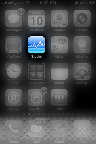
![]() First, the Stocks application gets a new icon. It’s not a total redesign, but they did take off the labels at the bottom of the graph in the icon. Also, the design of the line on the graph has more of a sharp line than curvy. Most of the app is still the same but there are some valuable new features. When tapping on the stock’s units on the right, in green or red, you now get a third option. Not only do you get the percentage and price change, but you get the Mkt Cap. Best of all, there’s a nice new landscape view. It’s a big, full screen graph like the small one in portrait view. Overall, a great update to a simple app from Apple. [Read more…]
First, the Stocks application gets a new icon. It’s not a total redesign, but they did take off the labels at the bottom of the graph in the icon. Also, the design of the line on the graph has more of a sharp line than curvy. Most of the app is still the same but there are some valuable new features. When tapping on the stock’s units on the right, in green or red, you now get a third option. Not only do you get the percentage and price change, but you get the Mkt Cap. Best of all, there’s a nice new landscape view. It’s a big, full screen graph like the small one in portrait view. Overall, a great update to a simple app from Apple. [Read more…]
Firmware 3.0 Preview: Stocks
May 10, 2009 by

